Over the last decade, we have begun to see a massive trend in flat design websites or flat UI compared to the alternative 3D or in-depth designs. Companies like Microsoft have reality adopted the flat look, but is it the best option for everyone and every audience?
Web designers are sometimes perplexed with asking themselves if flat design websites are the way to go or if it is even any good. However, we cannot argue that flat web design and flat UI are around us more and more.
It is always tempting to jump on a growing trend, but should you? This is what this article aims to help you answer, while flat web design isn’t suited for every project or audience, you can create wonderful and inspiring websites using a flat style, so let’s explore the trend a little deeper and work out its qualities.
- What Is Flat Web Design?
- History of Flat Design
- The Goal of Flat Design
- 10+ inspirational Flat Web Designs
- Take Aways
What Is Flat Web Design?
Flat web design is a web design style that uses simple shapes, colours and 2D elements to create graphics and website layouts. A flat design website will have a style that mostly strips out any 3D elements, uses a minimalist look and doesn’t include any bevels, texture or gradients.
Originally developed to aid in responsive designs, websites, mobile apps and graphics can be scaled more easily. Simple shapes, fewer textures and flat designs are much more adaptable in a short time frame compared with 3D elements and designs. This reduces the amount of data and loading times for mobiles or slow interest connections and users get a more streamlined experience.
History Of Flat Design Pioneers
If you prefer to skip this history lesson, jump directly to the Flat design websites examples that we have selected for you.
Flat design hasn’t been around for long but it was pioneered by top leaders with Microsoft and the release of Windows 8, Apple and their release of iOS 7 and Google with their change to Material Design.
The opposite of flat design as we have talked about is basically 3D and more in-depth graphics with bevels and shadows etc. This is known as Skeuomorphism design, something which people can relate to more as the designs usually relate more to real life and look more realistic compared to flat designs.
Another famous early example of flat design is Microsoft’s MP3 player application, Zune. It launched in 2006 and was one of the first major steps forward for flat design and UI to come out. Even though Zune didn’t become successful, its design and approach to UI live on and many of its styles can be seen within Windows 8 onwards.
Apple in 2013 really advanced the flat design approach when they completely got rid of the traditional Skeuomorphism design on the iPhone and adopted a completely new look. With the release of iOS 7, Apple redesigned the UI and went with a more basic flat look and stated that it was fine to disassociate users away from the Skeuomorphism design that helped users relate digital devices to real life. It was more important to switch and engage users differently with a flat design.
The Goal Of Flat Design
Compared to the traditional Skeuomorphism design, the push to transition so many popular apps towards flat designs with top companies like Microsoft, Apple and Google were to create a more simple, usable and intuitive look.
Some argue that the Skeuomorphism design doesn’t appeal to everyone because it tends to look more realistic and people around the world see things differently, whereas a flat design tends to appeal to the masses more, as a flat design can be less realistic but have a more general look and feel. Less personal touch, more likeable UI – However, that isn’t always true: it comes down to your audience and the type of website you are building.
Overall, a flat design’s purpose is to eliminate clutter, improve usability, streamline the experience and create a more general look for users. Plus it is quick and easier to design a simple interface that can be iterated on without much effort.
10+ Flat Web Design Examples
Flat design websites can be amazing and work really well for a lot of use cases: you can create beautiful, minimalist and elegant layouts that look amazing. Just make sure that your audience is suited for flat-based design and UI.
Let’s go through some inspiration flat design examples and get used to what some successful websites have done.
1. fullPage.js Flat Design Website
Flat web design is all about adopting a simple structure, working with that structure to create a materialistic design.
fullPage.js website makes great use of flat design. It shows a clear distinction between each of the vertical sections of the page and makes use of a minimalist design to highlight the main message.
If you are into full screen websites with a flat design, the fullPage.js component can come on handy for you. Available for JavaScript as well as for WordPress builders like Elementor, Divi, or Gutenberg.
2. Upsly
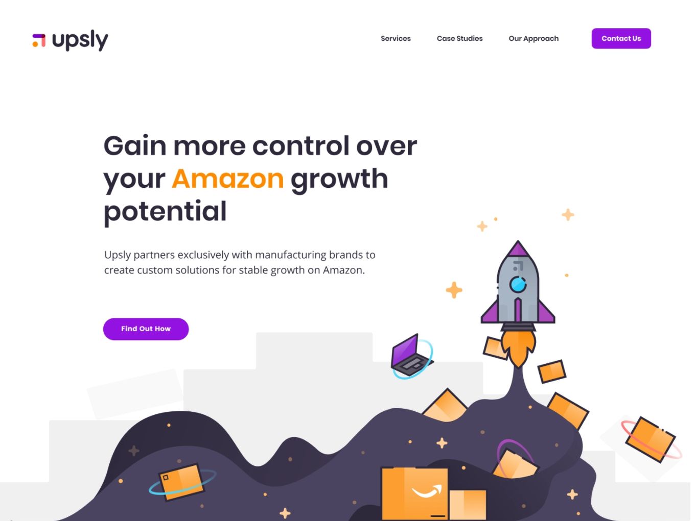
Here we have a hero landing design which is following the flat design style. No icons at all. The only complicated thing we have is the flat design illustration used as a hero image.
The navigation doesn’t use any icons, just plain text and the CTA (Call To Action) Buttons are using a stand out purple colour. A simple hamburger menu at the right-top corner is enough for further navigation.
Lots of space and the layout of this hero section is free of any clutter. The illustration is simple but only uses flat design techniques. The shading is just another plain colour, simple. Another great example of a flat design website.
3. CooWorK Web (Concept)
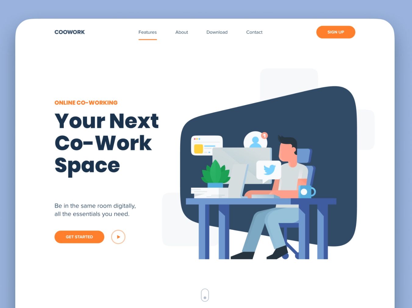
Flat web design is not just about bright colours and spacious sections: your graphics and icons have to be flat as well. This website design shows that really well. The graphic on the right is what a flat design website should look like.
Everything about this design, from the header to the navigation buttons and the text, is flat. You can see that the buttons are just a flat orange colour, navigation buttons have a flat line under them and there are no strictly defined sections on the page.
4. Marlow
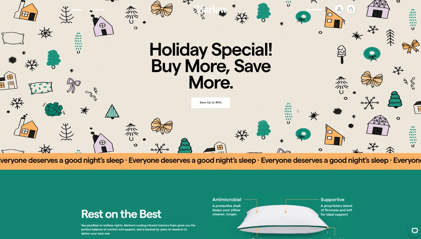
This website uses a modern, simplistic look and features many flat web design qualities like bold, bright colours, simple icons and graphics and very strong defined sections with straight lines.
Further down the homepage, you can see how simple the flat web design is. The header is just plain white, buttons in the navigation are just text and there are only 2 icons in the header bar.
The main content is given the illusion of floating on the page when its background is just one colour and everything sits on top. Very elegant and minimal to get information across, looking professional and easy to consume. Great flat design website.
5. Financial Dashboard Flat Design (Concept)
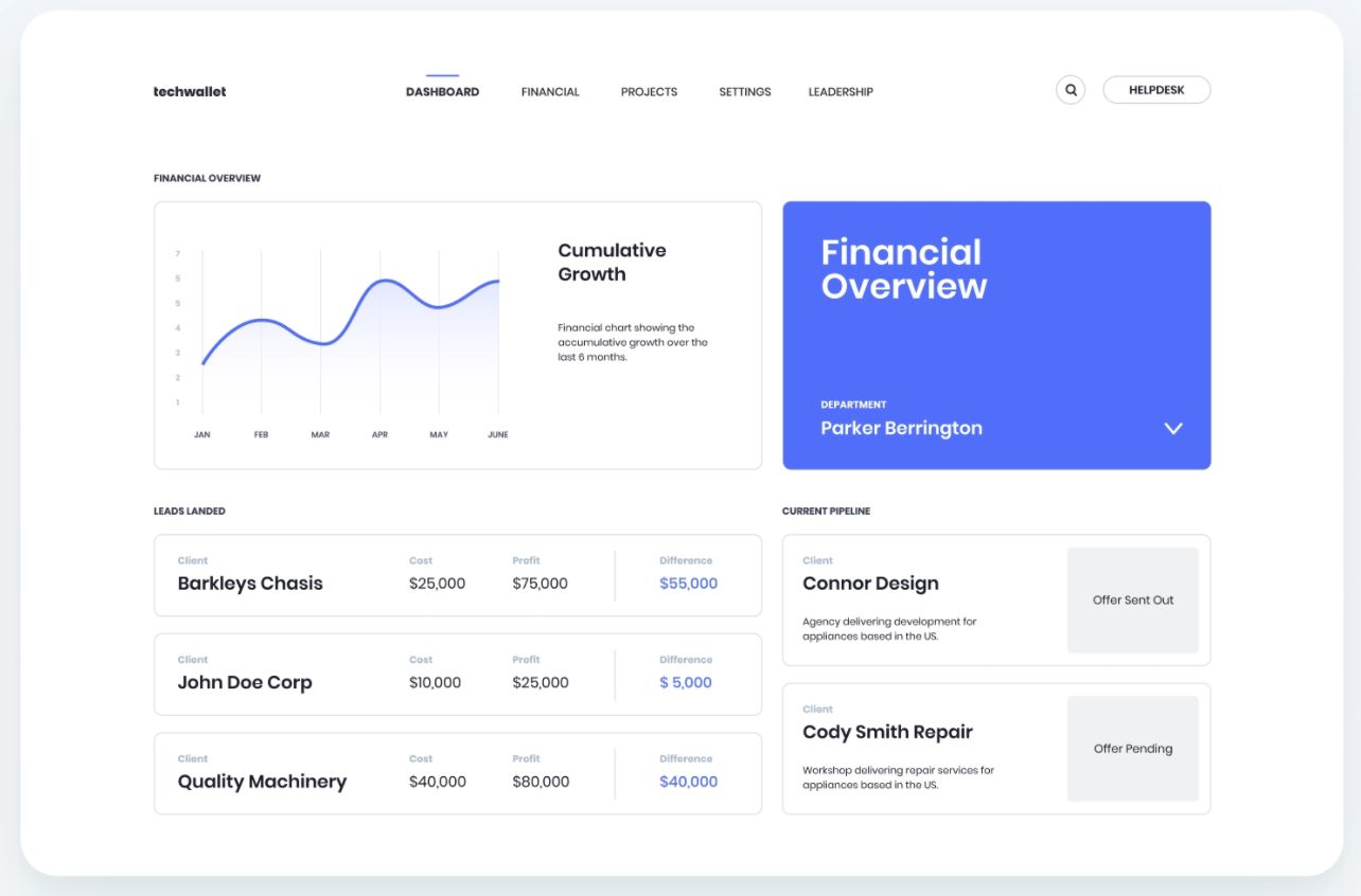
Even minimalistic and flat design dashboards are a thing now. In the past, you may have seen cluttered and crazy dashboards but this theme really makes everything look simple and easy to understand.
There is only one main colour and it is used only in subtle areas, except for the big bold square that acts as a massive button. But it is effective for working as the main content button.
The overall design is very spacious and easy on the eye, navigation is simple and doesn’t even contain any icons, just a line indicator.
6. Management Dashboard Flat Design Website (Concept)
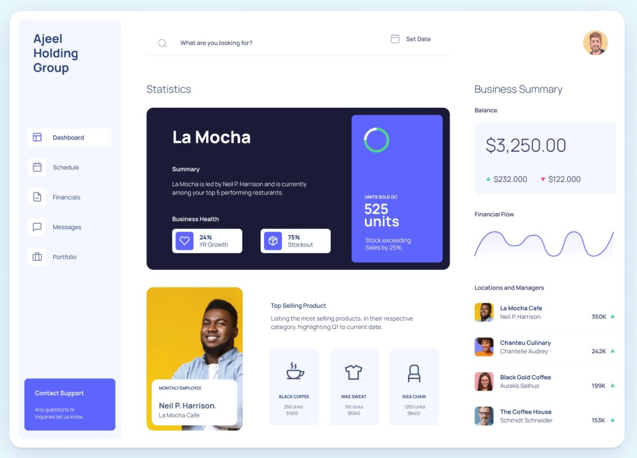
This flat design example has a lot more going on compared to the first few examples in the list. There are more elements to consider here. Each element/section is using a flat design: the colours are flat, icons are kept simple and each section is defined based on lots of white space.
Most admin dashboards always have a lot going on so a flat web design fits well here because it helps streamline the experience and content. The layout is simple and it is easy to consume the information as we have learnt.
7. Orizon
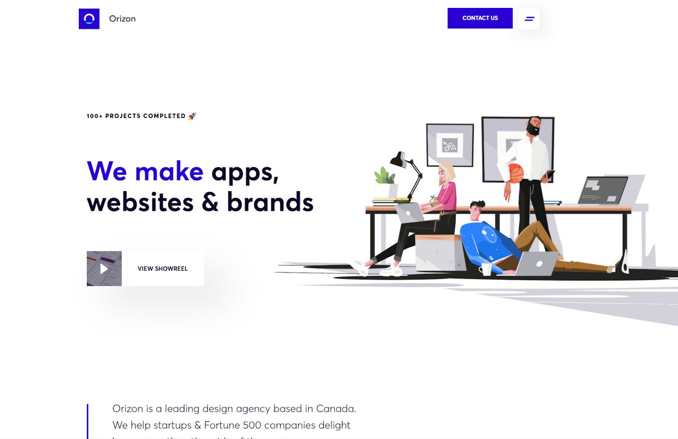
A flat web design centred around the use of tons of white space. It uses the white space to its advantage and it helps make everything feel fresh and professional with minimal personal preferences as if it could relate to everyone.
The selection of white background is not casual. That’s why we explained before the main reasons to choose a white background on a website.
The flat colour choice mainly sticks to one colour and only uses it to make text or icons stand out. As always with flat design websites, buttons are kept very simple and in this flat design example, it uses no icon at all.
8. Coboo Flat Web Design (Concept)
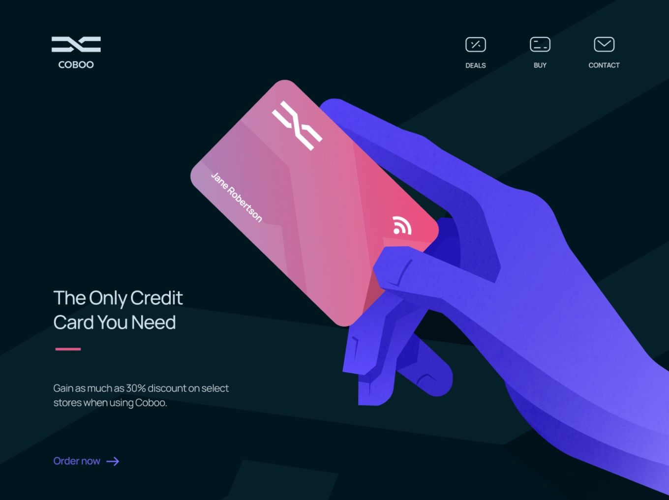
As stated before, a true flat design website will also have its icons and graphics kept simple. As you can see this website concept keeps the landing hero section simple with both the icons and the main graphic.
Colours are flat and instead of a shadow or gradient, the hand uses another flat shade of colour to pull off the same effect. Even the title has a reduced style with a short line underneath to help define it, but not too much.
9. Treecard
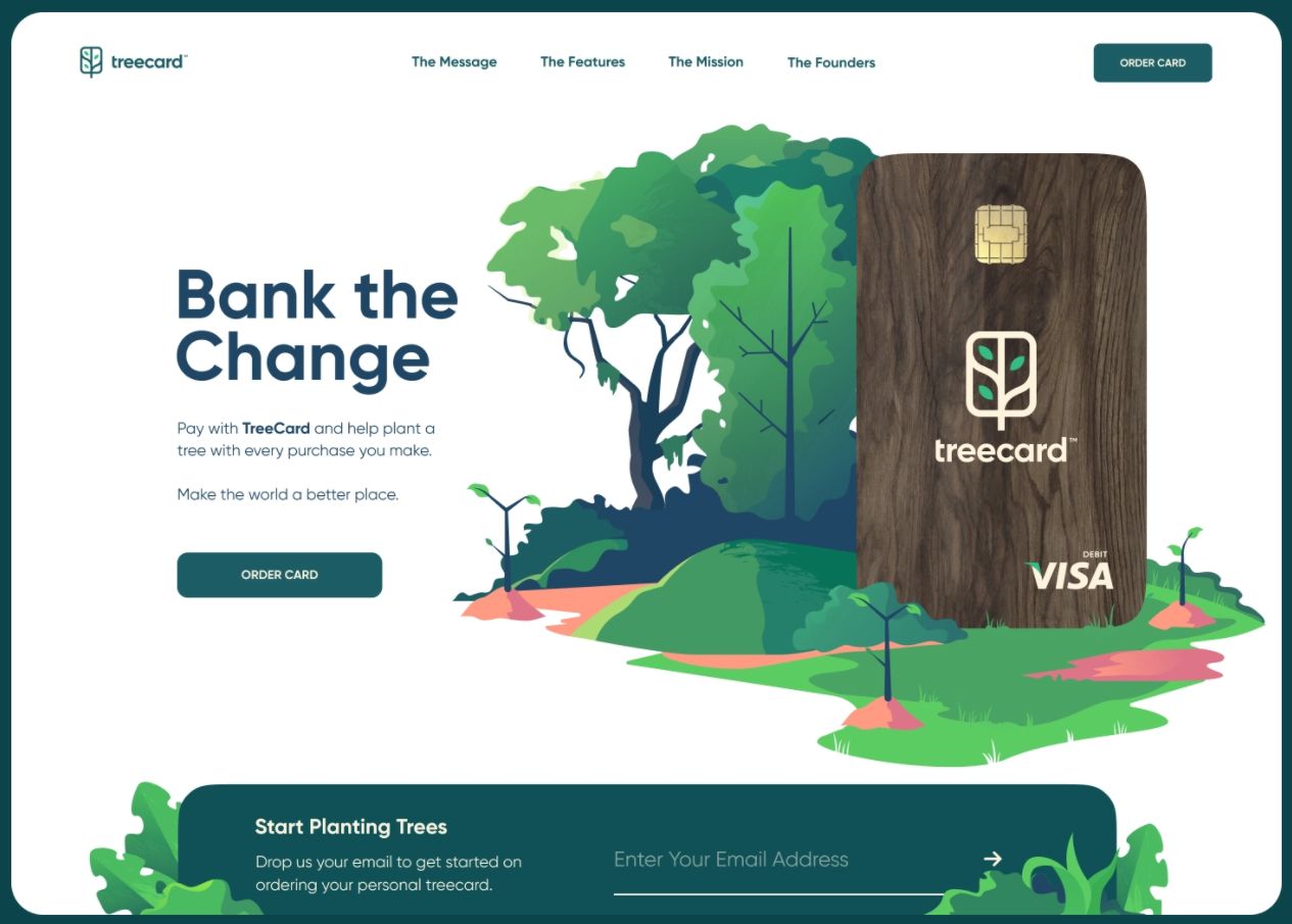
Another fantastic design that shows off how a flat web design with layout and graphics can match up and work really well.
Here the graphics are created using a flat theme and different colours are used to form a gradient effect. The navigation bar is simple: no fancy buttons, just one Call To Action (CTA) button to stand out.
10. Comparrot
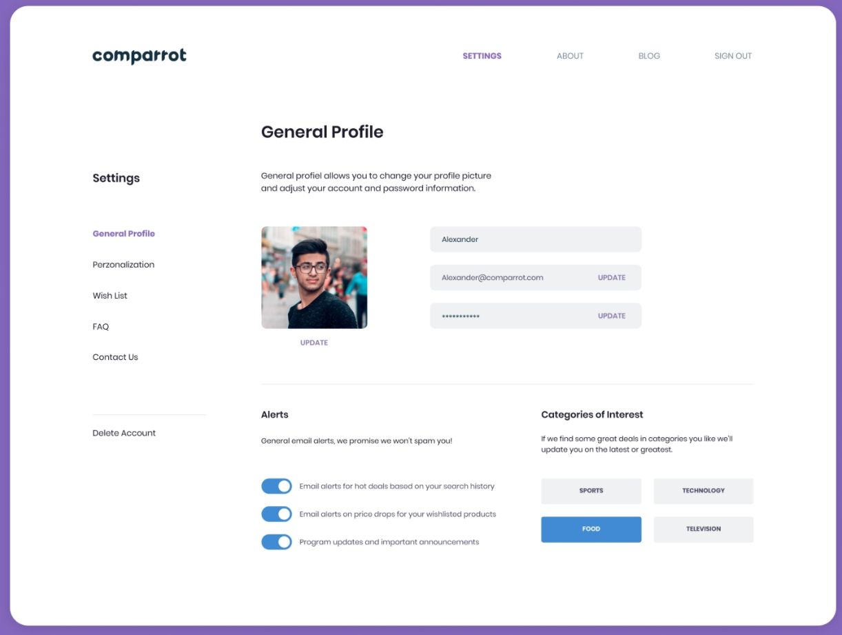
Overall this design follows the flat layout and style very closely. You’ll notice that the layout is simple, with lots of white space and everything is kind of floating on the page.
The colours are minimal, with no fancy icons or graphics to be seen. The colours of the inputs and buttons are completely flat, they have no shadow or styling to them, just a plain colour.
The design makes everything look simple and fresh, this page is easy to navigate and is clutter-free.
11. Versions Globa Website
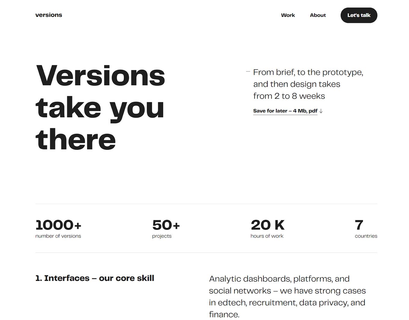
We have seen flat design examples that use one or two colours and a few graphics, especially for the hero section of the web page. But this website design sticks true to flat design and really reduces the design down even further than many other examples.
No colour, no graphics and massive amounts of whitespace to help separate things out. This flat design website really makes it easy to consume the information and buttons are stood out by using a black background on them.
12. Soldis Gradient Style (Concept)
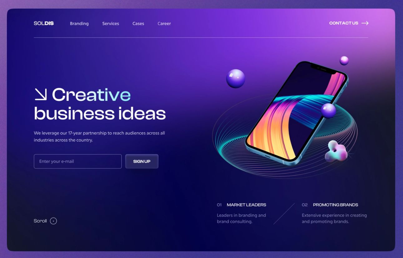
Maybe you are looking to be inspired by a flat design example that doesn’t reduce elements too far – Well this design uses a lovely gradient background with a minimal layout on top. The change of colour across the screen creates a premium look for the user and is different from the traditional flat design websites.
Still, though, the logo, header bar and navigation are true towards flat design and keep a minimal look. This design strikes a good balance between flat web design and using more than just one or no colours at all. Even the graphic is a little too 3D but it works well with the overall design and offers something different.
Takeaway
The flat design is not for everyone and certainly not for every project. While flat design websites work great for some audiences, we must be aware of what users want. So it is not always best to follow the trends, evaluate what works and what doesn’t first.
Some people argue that flat web design is boring and it is in some cases but that is usually when the design choice is used in the wrong context. For example, a gaming website is probably not suited well for a flat design; it will benefit more from 3D graphics, animations and multiple colours and elements on the screen.
But as you can see from many of the flat design examples here, this design works really well and you can create really beautiful flat design websites.
Related Articles
You may be interested in the following content:


